It is possible to write R Markedown then publish it on a web site in WordPress. WordPress is a software that manage the interraction between web visitors and the web server. It functions analogous to Php. Website owner do not need to know Php in order to have a website running. The Rmarkdown package posts raw Rmarkdown files to WordPress software directly by running a R files within RStudio. Running this code after saving the “post.RMD” in the same directory,
options(WordPressLogin=c(your_own_user_name='your_password'),
        WordPressURL='https://yourwordpressaddress.com/xmlrpc.php')

knit2wp(input='post.RMD', title = 'RWordPress Package',post=FALSE,action = "newPost")
This uploads the .Rmd file “post.RMD”. Next the website owner will need to log into the admin page of the WP site, click this file, then push the Publish button to publish the document.
After publication the owner will use “post id” to update this post. The post id can be found in the edit article URL. Once you are in the post editor, view the post's URL in your web browser's address bar to find the ID number. For example, the URL for this post is
here the post id is “378”. To post an edit of ths document, issue this command in R
knit2wp(input='post.RMD', title = 'RWordPress Package',post=FALSE,action = "editPost",postid=378)
That's all to it. The Rworldpress package is not actively maintained as of Dec. 21, 2021. So if WordPress makes any change in the future, the above steps may fail. R package “blogdown” was said to have some functions similar to Rwordpress. Let's check it out.
Note this article itself is an R Markdown document. For more details on using R Markdown see http://rmarkdown.rstudio.com. You can embed an R code chunk like this:
summary(cars)
##      speed           dist
##  Min.   : 4.0   Min.   :  2.00
##  1st Qu.:12.0   1st Qu.: 26.00
##  Median :15.0   Median : 36.00
##  Mean   :15.4   Mean   : 42.98
##  3rd Qu.:19.0   3rd Qu.: 56.00
##  Max.   :25.0   Max.   :120.00
Including Plots
You can also embed plots, for example:
Note that the echo = FALSE parameter was added to the code chunk to prevent printing of the R code that generated the plot.
Statistical methods reinforcing semiconductor manufacturing – review and discussion of U.S. Semiconductor Industry Qualification Plan
Outline: A quick summary of the Qualification Plan, how statistical methods fit in each of the three stages of the Qualification Plan, with actual case reference, and quick insight/discussion on the contribution of statistical methods. Focusing on the substantiated contribution (vs. unverified, theoretical suppositions) of each of the statistical methods.
Relevance of Statistical Methods in Manufacturing: Even in today’s high-tech manufacturing environment with very precise measurements and powerful processing capabilities arising from the advanced technologies, the demand for stricter equipment baseline settings, the discovery of new processing techniques to solve emerging problems, a thorough understanding of the process and equipment capacities, as well control of the high-tech manufacturing process is still relevant. For the majority of industries and do not employ high precision equipment, traditional statistical methods should live strong and well for a long time.
Three areas that we focus on to achieve immediate impacts for tech businesses are:
Gauge study. High-precision equipment can achieve even better goals
Minimizing experiment runs for expensive experiments. Design experiments to suit specific production environments. Optimization of a process. Discover the cause of failures or defects.
Measure and control process and equipment capacity
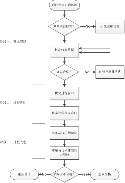
We will discuss the ways to statistical methods that would improve each of the three areas with actual case examples. In the case example, we will emphasize how the statistical methods accelerate the efforts, make impossibles possible, saved expenses and deliver better products. Below is a diagram of an ideal manufacturing qualification plan should look like, each of the three stages involves many of the statistical techniques we will discuss in this sequence of articles.
The following main skills are essential for researchers and technology innovators:
Data summarizing knowledge
Uncertainty and quantification of uncertainty
Predictive models
Design and analysis of experimental data
None of these are either trivial or easy. We will discuss in separate posts the above topics for practical application that will provide immediate benefits. Further study is always welcome such as through university courses or reading advanced texts. In each of the posts, we will first summarize the basic knowledge, then illustrate how this knowledge may be applied in the real world setting using one or multiple scientific and technological application examples.
1. Data Summarization Basics
Data Summarizing Knowledge is the basic skill for all data analysis methods. A good understanding of the data provides a foundation for locating the best method to tackle scientific and technological problems. To understand data, the first step would be to check on
Types of the data (numerical, categorical, or a mix of all)
Structure of the data (a series, multiple series such as in a table, unstructured such as texts or images)
For numerical data, to summarize the data we need to focus on
The center of the data (mean, median, mode, quantile)
The variation of the data (variance, max, min, range)
The distribution pattern (symmetric vs. tailed, the direction of skewness)
For categorical data, to summarize we need to check
The frequencies or relative frequencies of each category
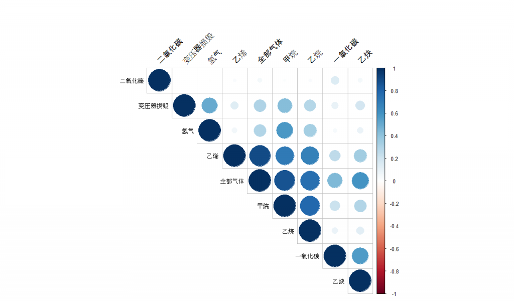
If the data contains multiple series such as those usually appear in a table, in addition to the above actions on each of the individual series we need to check the statistical relationships between the series (columns or variables in a table) as well. The most common statistical relationship is the linear correlation. A linear correlation exists between numerical series, between numerical and categorical series, between categorical and categorical series. More about that will be described later. A complete correlation matrix helps us understand which two series are closely related. Note this is just to gain very basic knowledge, there are many relationships that are hidden quite deep, we will need more advanced methods to discover, which we will introduce later. Linear correlation paints a direct picture of the association between the series. Often it tells us how these series are related.
#################### Readin Rds data
Transformer <- readRDS("data/Transformer.RDS")
my_data <- Transformer[, c(6, 12:19)]

#################### Calculate and display the correlation in correlogram
par(mfrow=c(1,1))
res <- cor(my_data, use = "complete.obs")
corrplot(res, type = "upper", order = "hclust", tl.col = "black", tl.srt = 45)
In integrated circuit (IC) manufacturing, engineers need to ensure the polycrystalline lines on the wafer are perfectly straight up. There are millions and millions of these tiny lines with a square millimeter area, and these billion lines are created together in a plasma chamber. Today we will introduce an experiment method to find the best equipment settings, the method of Response Surface.
Reactive-ion etching (RIE) is a microchip silicon wafer etching technology in chip fabrication. It uses chemically reactive plasma to remove patterned silicon dioxide “film” deposited on wafers. The plasma is generated under a low-pressure vacuum by Radio Frequency electromagnetic field, with chemical gas vapor injected in. The right combination of Radio Frequency (RF) electric field power, the pressure of the vacuum, and hydrogen bromide (HBr) gas injected into the etch chamber are the key factors lead to the quality silicon wafer. Engineers will need to ensure the profile of the polycrystalline silicon gates isotopic, that is, the walls of the etch lines should be vertically perpendicular to the substrate in all directions.
In this study, the engineers would like to find the right processing settings for this etching equipment. As this is a million-dollar business, we are going to help them, using design of experiment methods.
Data and sample R commends (user needs to load data to R)
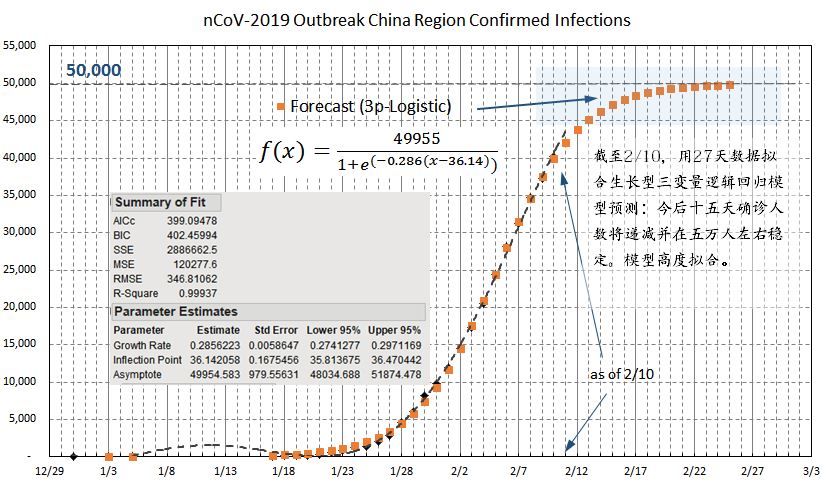
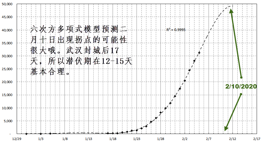
The pattern is getting clearer. With my 3-parameter logistic growth model fits as of February 10, 2020, the total confirmed cases will stabilize around 50,000 cases. The model came with a 0.9994 R-square.
Such a near-perfect model-fitting with 27 data points is not surprising. China’s enormous national effort to collect the patient data enables results in high-quality data, which approximates very closely many natural growth patterns.
With the latest confirmed 2019-nCoV infections on Feb. 7, 2020, the time when new confirmed cases will stop emerging. As indicated in the forecast shown below based on a simple order-6 polynomial model on confirmed cases using data since official data release December 29, 2019.
The significance of this prediction potentially confirms the actual virus incubation period among humans. Most experts have estimated it to be somewhere between 12-15 days. If the Feb. 10 or a few days after turns out to be the date no more significant new confirmed cases, then this estimate is then reasonable, as China started sealing off Wuhan then cutting off essentially all people-to-people form of transfers 17 days prior to the estimated Feb. 10. It also supports the fact no new form of the virus is causing similar infections.
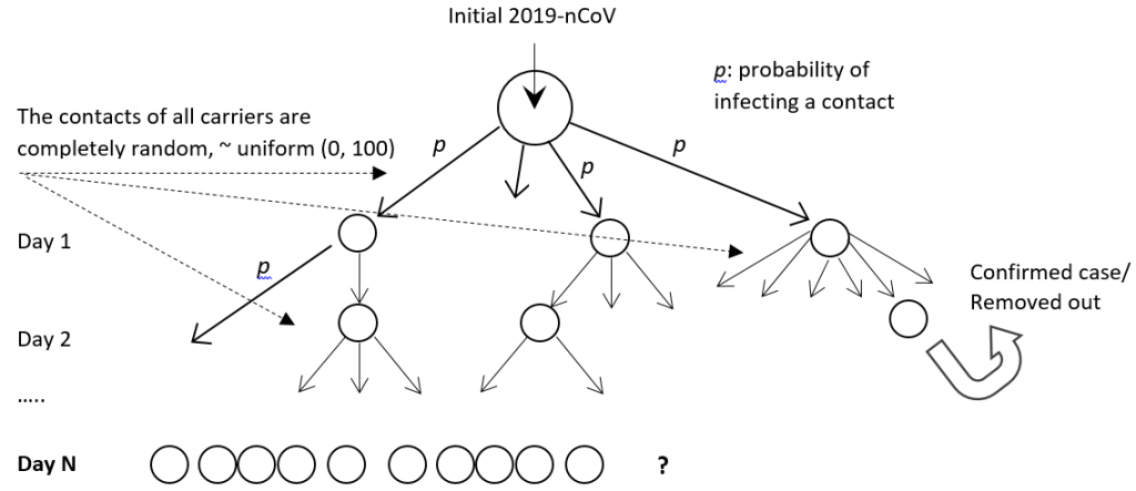
Common infectious disease studies for disease spread pace and infection rates among population rely heavily on fitting predetermined epidemic formulas, which in reality resembles nothing how flu virus actually spread. Here I propose a stochastic simulation model that mimic the actual virus spreading mechanism among people, see the model diagram below.
STOCHASTIC VIRUS SPREADING model
In this stochastic simulation model, we to mimic the actual virus spreading mechanism through computer simulations of how virus are passed from people to people and how people may or may not develop symptom and therefore passes virus to more people the second day. For those developed symptom will be removed out of the spreading chain. We randomly chosen based on a probability distribution the following:
(1) The number of people a virus carrier might meet each day, (2) The number of contracted patient would develop symptoms, and (3) Who with confirmed contraction would be quarantined from the population.
Samples are drawn on daily bases, and are drawn based on defined probabilities. This is different from fitting a deterministic model afterward in most published epidermic studies today, and are much closer reflecting how actually the virus spread in real life.